Page 2 of 3

Free Inquiry Post #3: Gesture Drawing

I’m diverging a bit from my initial goals and framework for this post. I’m not too upset about it though, being distracted by other art things is an ideal I want to strive for. If I’m going to be distracted by stuff all the time, it might as well be stuff I want to work on and get better at.
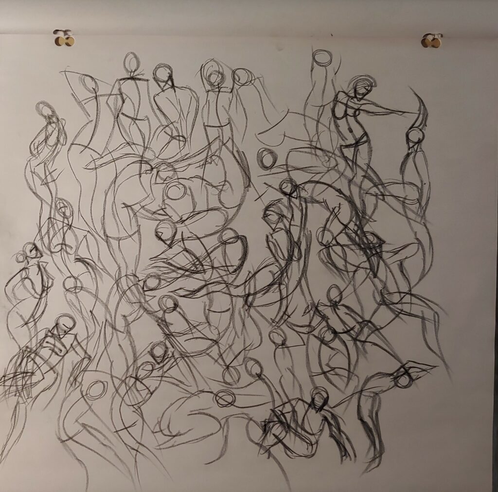
The gang’s losing differentiation again

Recently I started getting back into figure drawing a bit again. I’ve been very slowly unpacking the few things I have left to unpack in my new apartment and pulled out my sketchboard. I knew where it was but it still felt like finding it in a way? I had partially forgotten about it, at least I wasn’t consciously thinking about it much. It got me in the mood to practice some figure drawing again, something that I find pretty relaxing when it’s more technical stuff. I don’t even know where I’d begin with more creative applications of it, but it’s something that I’ll need to plan out and work on. I use a Youtube channel called Proko for learning how to draw figures. Their website can be found here but I normally use their Youtube channel, specifically their series on figure drawing. I’ve made it up to their video on mannequinization, but regularly go back to the earlier videos to practice gesture drawing.

Gesture drawing is like the first framework of a gesture drawing and is the main thing you build on top of. Gesture drawings are really fluid and intended to capture motion and energy rather than totally accurate proportions. I usually warm up by watching a Proko video and drawing along with it. I tend to pause the videos pretty frequently and watch sections over and over to try to pick up what approaches the instructor takes to represent the gesture. Recently I’ll try drawing the pose myself first and then with the video to compare the two (if you look at the picture above you might be able to find some repeats of these gestures). Then I’ll work through some poses on my own using the free pose reference images on Line of Action. This site is a really handy tool for figure drawing. You can specify the types of reference photos you want (i.e. filter out nudity) and set timers for how long you want to have to draw the photos (in the above image I did 30s and 90s drawings). They also have class modes which give a variety of times starting with a lot of shorter ones and slowly building up to longer sessions. I haven’t used this feature much, but I should so I can get more practice with longer figure drawings. The picture above is really chaotic, but doing gesture drawings on top of each other is a great way to save paper (and in my opinion makes a pretty cool end result).
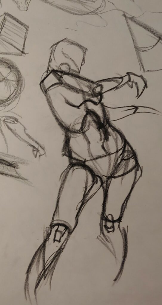
(Can’t take too much credit for this one because I followed one of the videos for it)

I’m struggling a bit to find someone to critique my drawings. I used to send them to a friend of mine and discuss them with her but she’s been really busy recently and I don’t want to send more work to her. I can normally spot when things are off, but it’s tricky to find the directions I need to take to correct them. I might start using some online forums to try to get critique (at least ones where people seem friendly). Critique is really important for making improvements in art and me doing art in pretty solitary ways feels detrimental. It’s a hard thing to plan and ask people for and I definitely think that some of my art anxiety gets into the mix and messes things up.
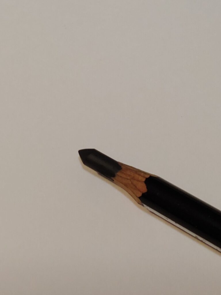

This is my pencil worn down and in need of resharpening. The end isn’t as long as I’d like and it doesn’t reach the tip gradually enough.

I find that gesture drawing is a really nice relaxing activity for me. The lines are fluid and having the sketchboard gives me enough space to draw larger lines with my arm. I really like the type of pencil that you use for figure drawing too. I was introduced to Conté pencils through the Proko series and really like working with them. Charcoal is a favourite of mine, but it gets really messy and I tend to accidentally touch things around my desk while my hands are covered in it. Conté is essentially charcoal held together with clay. Still gets my hands pretty dirty, but there’s a lot less dust to deal with. I usually wear all black so staining from it isn’t much of an issue thankfully. The main issue with using these pencils is sharpening them. Figure drawing is best with a long section of lead exposed. Having this longer mark making section and a curved point is really useful for representing different lines and controlling how dark lines are. Proko discusses this here. I love drawing this way but there’s a few issues with it. The first is that I’m hoping to eventually start drawing digitally more. The stylus I use for my drawing tablet doesn’t really have a large section like this. You basically just need to use it like a regular pen and hold it in a normal tripod grip. Being used to holding a longer pencil in an overhand grip might make for a bit of a learning curve, but I think I’ll get used to it. The second issue is fairly minor but incredibly frustrating. Having a long piece of lead like this makes it a lot easier to break your pencil. This is obviously frustrating, but I find that it just totally derails my art practice and usually signifies the end of it. Re-sharpening the pencil takes some time so I’ll usually do it to set myself up for next time. I’ve found that pencils can often stay broken once they break like this which is really unfortunate. I’m not sure if the tip snapping sets off a chain reaction down the pencil, but the end result is pencils that practically can’t be sharpened. I’ll spend a ton of time sharpening and sanding to expose more lead and the new tip will just drop off because of a fracture already present.


I’m pretty glad to be getting back into figure drawing. It’s something that I enjoy a lot and find really relaxing. I’ll just need to be pretty vigilante about making sure I move forwards with my practices and get out of my comfort zone. Gesture is an important skill and one that I need to work on, but I can’t spend all my time working on it until I arbitrarily feel “ready” to move forwards. Getting stuck repeating earlier stage things like this definitely affects the types of creative things I do as well. Often I’ll be hesitant to attempt creative ideas because I don’t think I’ve done enough fundamentals to do them well. This is something that’s a really big hurdle for me in art, but I’m hoping that I can confront it with time and practice. I’ve been trying to be more vigilante with assessing myself and it seems to be working? I try to judge how much energy I have and base my decisions on that. If I’m tired and a bit burnt out, I’ll focus on low pressure exercises like gesture drawing. If I have more energy, I’ll try to do “scarier” exercises like the things in Draw A Box. I’ll try to mix casual doodling in with both of this scenarios and do it while I watch YouTube videos or TV shows before bed. If I have a fair amount of energy and am in a decent mood I’ll work on larger creative projects. This last condition isn’t super strong unfortunately. I’ve been working on creative stuff more recently, but still not as much as I’d like. I think I need to just spend a lot of time doing it casually to help get rid of the perceived stage-fright that comes with creative art. I think even just me treating it as some huge monumental task that I’m constantly building towards adds a lot to the pressure of it. Trying to do it when I’m lower on energy might not be an awful idea. Could help take some of the pressure out of it.
Free Inquiry Project Post #2: Linework

Linework is an important part of a lot of different art forms. It’s a skill that really bleeds into other artistic practices as well. Learning how to confidently draw lines carries over to things like making confident paint strokes. I REALLY struggled with linework when I first got interested in art and, like most things in art, I’m still working on improving it. My biggest problem was my anxiety. I’d feel a lot of sudden pressure before making a mark and would mess up my lines because of that. I could “ghost” the lines decently and practice the motions of the line prior to making it with no problem. When I actually needed to make the line I would feel a lurch of anxiety and overthink it. I found that enough practice helped me get over this effect which made a big difference for me. Linework is something that I come back to and practice regularly. It’s a nice fundamental of art because you make a progress in it by just doing creative things you enjoy. That being said, it’s really important to be vigilante about monitoring it and make sure you aren’t slipping into bad habits. For this reason I like doing exercises that are focused on linework and the fundamentals of art that can be practised alongside it like perspective.

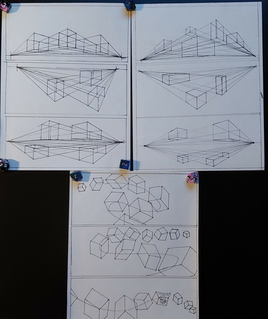
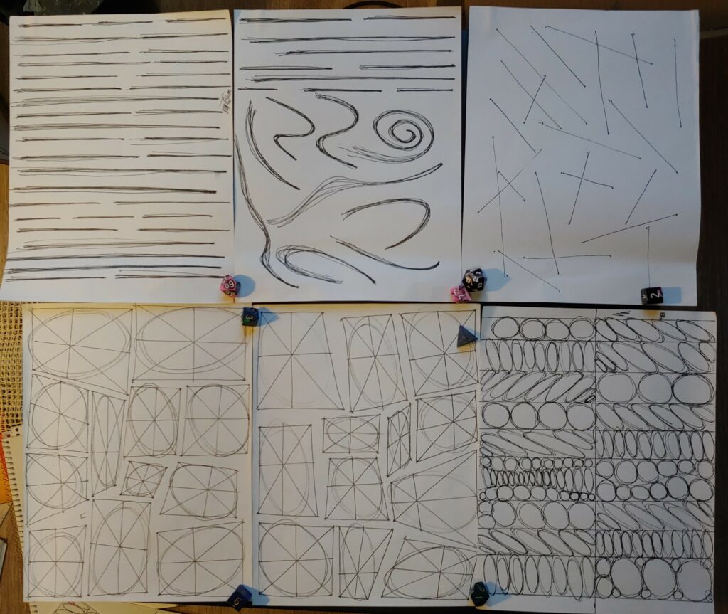
The first few lessons in the Draw A Box Program

One of my favourite resources for working on this is Draw A Box. Draw A Box is a pretty intensive program, I fell off my first few attempts at starting it. It’s something that I try to come back to readily now. I’ve found that their advice has really helped me take large steps in my artistic abilities. The first few exercises focus largely on just drawing straight lines. It teaches a lot of really useful techniques like drawing confidently from your shoulder and arm instead of wrists and fingers. These exercises are largely focused on things like drawing a line over a ruler-made line, drawing a line between two points after ghosting it, and eventually drawing 2D planes. These exercises have a really nice through line to them. They slowly build up to the perspective exercises while never really abandoning a past skill. Things like the 2D square planes are still basically just exercises in drawing straight lines between points. There’s a few things that disrupt this mold a bit, the ellipse exercises diverge from this gradual process because of them being round ellipses not containing straight lines. Draw A Box still connects them to the past exercises by using the previously drawn 2D planes as “frames” for ellipses. This will help tie into future exercises involving cylinders and helps give students an idea of how ellipses behave in perspective.

Some of the later Draw A Box lesson 1 exercises focusing on perspective and distance


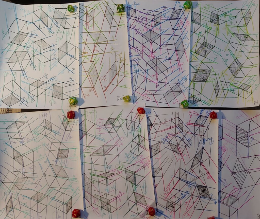
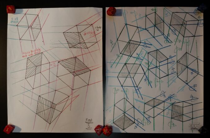
Some of the many many boxes I drew over the summer

During the summer of 2020 I got to the most dreaded part of this program (and the thing probably that gives it its name). This part of the program is called The 250 Box Challenge. There really isn’t much I can say to describe it that the title itself doesn’t say. During the summer I’d try to draw about 10 boxes a day. I was locked down for the summer which made for a pretty perfect environment for this challenge. I spent a ton of time either drawing boxes or wandering around outside, but it was a pretty enjoyable summer all things considered. I thought that this was a really useful exercise, despite the challenge it presented. It was really great for getting me a ton of practice with shapes that are really important for drawing construction. It helped me a lot with perspective as well. If you look at the exercises above you can see coloured lines extending from the lines that make up the boxes. These lines let me check how the box lines converge and assess myself. There were a few times were I extended them in the wrong way (I really found that boxes can create an optical illusion where they flip orientation depending on how I looked at them). It worked as a really good form of assessment, you might be able to see some arrows where I marked lines that went off course. Another form of assessment I had was critique from a friend who was doing the exercise at the same time as me. It was pretty difficult to critique each other because most of the time the lines told everything they needed to. It was good practice for getting peer-critique at least (something that I’m really bad at seeking out). It was really helpful to get motivation from someone else doing the exercises as well.

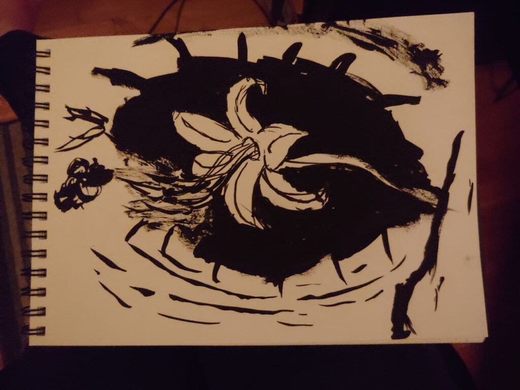
After that summer of boxes I actually dropped the program for a bit. It wasn’t because of a lack of motivation or burn out luckily, I just wanted to focus more on figure drawing for a bit and practice that for a while. I’ve been a bit of an actual art lull recently, mostly kicked off by the chaos of moving and working over the last summer. I’ve been slowly getting back into a rhythm of art again which has been quite nice for me. I decided to pick up Draw A Box and have been doing some gesture drawings to practice figure (something I’ll discuss in the next post). I still find creative drawings really scary and a lot harder to motivate myself to do. I find that just turning my brain off and doodling is good way to practice that while still relaxing and enjoying myself. I tend to motivate myself with new materials a lot too. I’ve been really wanting to play with some India ink so I got some recently. It lead to me making a piece of art that I’m really happy with, but didn’t really plan beforehand.

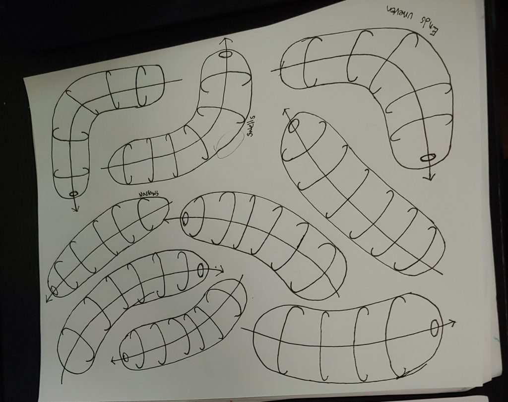
One of the organic forms exercises
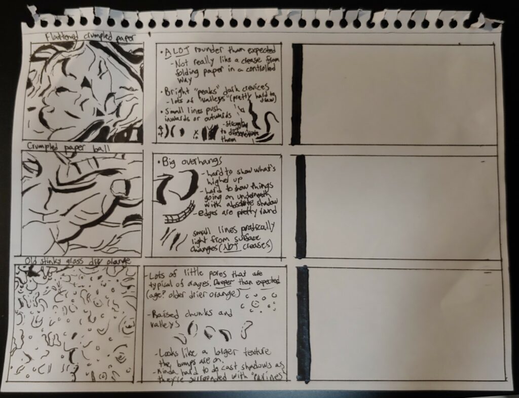
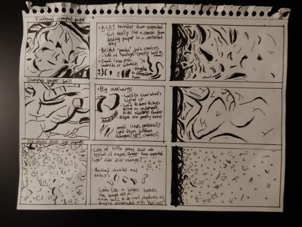
My unfinished texture exercise. The right box is supposed to be a gradient of the texture being studied

Getting back into Draw A Box relates to my initial goal of painting some plants in watercolour too. The next few exercises are focused on organic form and texture, but they build up to exercises on construction. I’m really looking forwards to these exercises but definitely feel a lot of nerves around them too? I’m not entirely sure where the fear comes from, I’m not afraid of messing up and I kind of expect to. I think there’s a fear of failure that’s a lot more intense than failure itself. I’m not entirely sure if it’s been conditioned into me from things like school or the way my ADHD works. I often get extremely invested in tasks which can make it sting more when they aren’t exactly what I want. I put off the texture exercise a lot. I had actually halfway completed it prior to getting to this week but had dropped it before doing the “texture gradient” part. It took me a while to do the first part too. I had bought an orange to use as a texture reference. By the time I did the exercise it had gotten really dry and old. I was proud to get it done though. I finished the texture exercise this week and will be trying to move ahead in the program. There’s still a form dissection exercise before the construction stuff, but I think that should still be kind of fun (as long as I can remind myself that drawing is something I enjoy).

The finished texture exercise


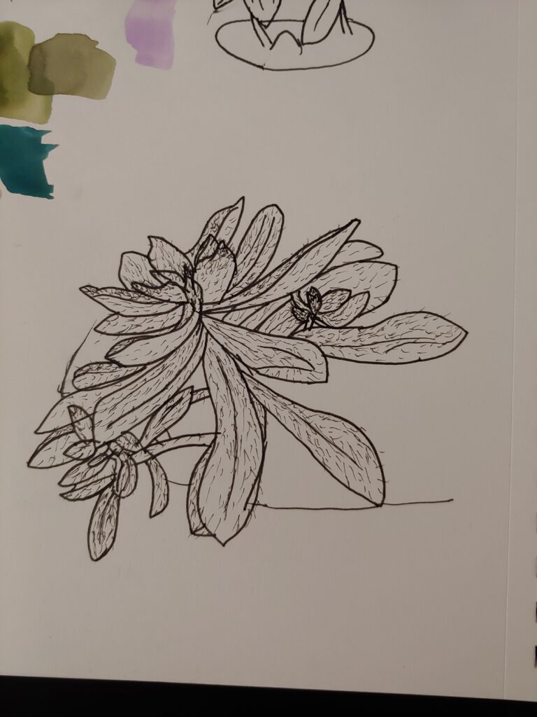
I thought it would be fun to give myself a reference point for my construction abilities before and after the future construction exercise. I drew one of my plants as a study and tried to be as accurate as possible. I focused on drawing the things closest to me first so I wouldn’t have to deal with overlapping lines too much. I’m really happy with the end result of this exercise. There were a lot of lines that I really messed up, but once the whole picture was done they were pretty hard to notice. Nice to have this plant line-work too. If I get too interested in other things I might just come back to it and paint it to mentally check off my initial goal. Feels a little like cheating, but there’s no rules here. As long as I’m actively doing art I think I’m pretty content. I’ve included the India ink drawing I did down below.

EDCI 336: Week Five Reflection

This week we focused on graphic creation and there were a lot of fun things covered in this class. I’m pretty familiar with photo-editing programs like Photoshop and GIMP (GNU Image Manipulation Program) and visual art programs like Clip Studio Paint but was interested to see what types of other options are out there. I was really really surprised when PowerPoint was brought up, but it seems like a phenomenal resource. I’ve done similar things with the program before for making images, but it was usually just to make images of slides. Using it to combine images and apply effect is something I hadn’t thought of before. It’s a fun tool to play around with too. Already knowing the way PowerPoint works makes it pretty easy to get adjusted to editing images with it.

I think that PowerPoint will serve two main functions for me with this. The first is for the SmartArt graphics which I really like. Trying to build a graph like the ones available through SmartArt is always really frustrating (especially if you’re using a picky program like GIMP). I think that I’ll get a ton of use out of this feature in teaching and just for personal uses as well.

The PNG graph prior to adjustments
The PNG graph after adjustments

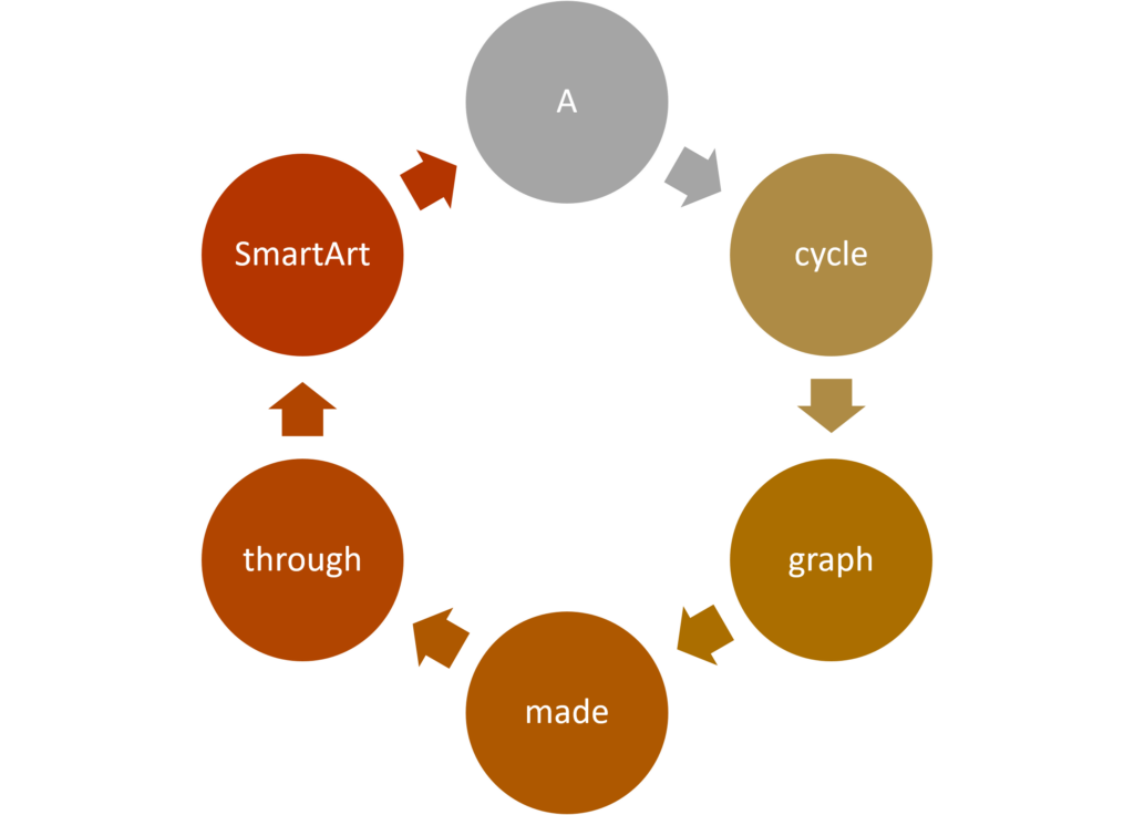
These images are super useful although they need to be treated fairly carefully. The version on PowerPoint is a vector image and stays clean regardless of adjustments, but exporting them as a raster image can lead compression artifacts becoming an issue. Ensuring that the graphs are made with this in mind is helpful for reducing this effect. In the case of the graphs above, I removed the outlines around the shapes and changed the font to a thicker one.

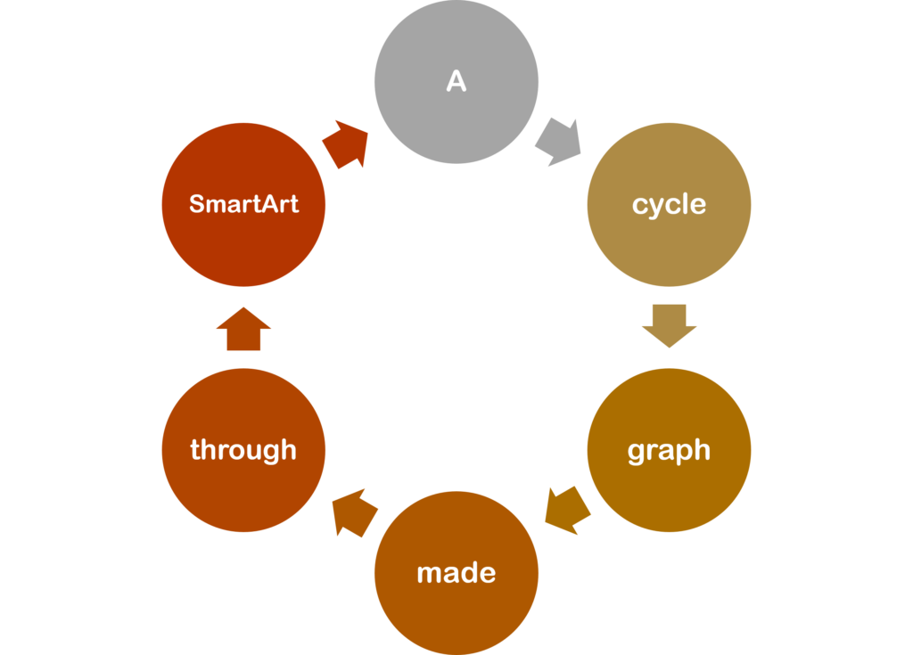
A vector image cycle graph made using smart art

PowerPoint does give the option to save these graphics as vector images (as .wmf and .emf files specifically). I’m not entirely sure how good this conversion is though. Something changed between making the images on PowerPoint and putting them in this WordPress blog. If you look at the graph above you can see that the font has been changed and a lot of the text is no longer centred in the circles. I can’t truly fault this to PowerPoint though. WordPress doesn’t accept .wmf and .emf filetypes due to security risks so I needed to convert them to .svg (the standard vector image file type) through a file-conversion website. The text was either changed when I saved the graph as a .wmf and .emf from PowerPoint or when I converted those files to .svg images. I’m writing this from a school computer and don’t have access to any software that would let me look at the .emf and .wmf files unfortunately. It’s definitely a difficult trade-off and the differences can be seen quite clearly in the graphs on this blog. The .png graph with adjustments has text that fits with the graph aesthetically and is centred in the circles (although it still has a bit of blur). The vector image graph has much cleaner shapes and texts and doesn’t seem out of focus like the .png version.

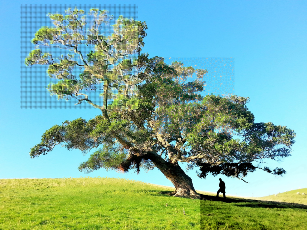
Original Image by Gilly Stewart on Unsplash

The second function is adding “artistic effects” to images. I find that photo filters can be a bit hard to track down, although I haven’t experimented too much with other programs. They’re really straightforwards to use in PowerPoint. The filters are easy to find and the advanced options give a decent amount of flexibility. I made the image above by inserting the same image several times, cropping them, and then applying the filters them. It works well to give the impression that different areas of a single image are under the effect of different filters.


I tried out the in-browser vector image editor Vectr during class. It seems like a really good tool for creating vector images in terms of accessibility. Not needing to download software is convenient and would be good for a lot of people. It’s understandably limited in a few ways, but for what it is I think it’s a good tool. I think it can be a bit lacking in teaching people how vector graphics work and how to make them through other means. For someone unfamiliar with vector graphics it could be slightly frustrating. Shapes often change when shrunk or expanded which is something that needs to be accounted for and worked around. The guides to position shapes are really well implemented and it’s a quick process to line things up with each other. Free-drawn lines can be a bit strange, but nothing too extreme that would make them no longer useful.

The effect of shrinking the “rounded rectangle” shape in Vectr

Other Useful Resources

EDCI 336: Week Four Reflection

I really enjoyed this class. I found working with the video editing programs and H5P. I think that they’ll both be really useful tools for education. I particularly like H5P. It seems like a really good way of making sure that students are engaged with video content and being reminded of the key ideas that I may be trying to focus on. It definitely isn’t something that can substitute making the videos engaging by their own merits, but it’s a good chance to subtly help students get back on track if their minds start to wander (something that I personally need to wrestle with a ton).

I found that this lecture-structure worked a lot better for me than the other lectures too. I’m genuinely not entirely sure how well I would’ve handled a full lecture. I tend to lose a grip on really long classes that focus mostly on lecturing without a ton of other things to break them up. Today was particularly bad because I doctor’s appointment via phone later on in the day and was pretty anxious because of that. It made me pretty fidgety and I was struggling a bit to engage with the material normally. I was also worried about the fidgeting itself being distracting for other people.

Getting the chance to do some of the workshop exercises in class really saved me. It was a bit difficult for me at first because I was struggling to read the instructions with all the conversations going on around me. I found that putting in my earbuds but not playing anything through them worked pretty well to help tune things out a bit. I got into a rhythm with working once I was doing it steadily too. I got through most of the iMovie workshop and the H5P workshop. I was really interested in learning more about video editing going into this course and I think that really helped me get engaged with the workshops. I found them to be really helpful too. I have some experience with video editing software but I mostly tend to use it on the fly. Having a guide that walks through the different elements of it is really nice. I would mostly just try to figure out how to make something work through trial and error. When I did look up how to do things it was normally just specific tasks and didn’t give me a bigger picture of how the programs work.

I really like the way that the workshops were set up and I think that they’re phenomenal resources to have. I’ll also be checking out some of the other workshops that Rich McCue runs to see if there’s subjects that interest me.


Workshop links:

  • Video editing software
    • Openshot (windows)
    • iMovie (Mac)
    • Davinci Resolve
      • Not one of the guides that was given to use, but Rich McCue discussed it a bit with me. It sounds like a really good free video editing software, albeit a bit more advanced than Openshot or iMovie.
  • Podcasting
  • H5P

(There are way more workshops as well, these are just the ones that were brought up in class)

EDCI 336: Week Three Reflection

I found Jesse Miller’s presentation to be really interesting. I’m glad that he approached social media and the internet as aspects of our lives that we can’t just ignore in the classroom. I see a lot of people talking about phones and what to do to manage them. Phones are definitely a concern for me, but I agree that taking them away from students is a bit too extreme. There’s a lot of responsibility that comes with doing that, and frankly I think it’s an overreach of a teacher’s power. Taking phones has the potential to affect student attendance and students could be using them in good faith or as a coping mechanism. I think phones are something that teachers should out-compete rather than something that teachers need to separate from students.

I found the self-searching to be a pretty interesting exercise. I’ve done it a fair amount of times with my deadname and have struggled to find anything that actually relates to me. My name was pretty generic and was shared with some cricket superstar. Hard to find any information about myself with all the results relating to him taking up all the space. Also a bit of an existential experience, I don’t think I’ll ever get to a “suggested search: desktop wallpaper” level of fame of popularity ever. There’s also a local actor who shares that name. I find it a bit strange that I could have watched a commercial featuring someone who lives on the island and had the same name as me.

Searching up my actual name is interesting. There’s definitely less results and the people who show up are just other normal people. I’m curious if more results relating to me will start showing up as a create an online presence while going by my preferred name. It’s definitely comforting to have that element of control too. All of my other online presences use usernames that aren’t related to me. I don’t really have anything I’m concerned about students or parents seeing, but having the comfort of it being pretty inaccessible is nice.

Free Inquiry Project Post #1: Mixing Greens

Featured image: Chris-martin, Public domain, via Wikimedia Commons

When it comes to drawing plants, the colour green is (unsurprisingly) a pretty critical element. Creating green shades can run into a lot of the same issues that mixing other colours can, but green has a few complicating factors. The first factor is that green is an incredibly common colour. Most people are familiar with all the varieties it can come in from nature. Blues and reds come in many shades as well, but encountering these shades in your day-to-day life is a lot less likely. The second factor is that green is a complicated colour in how it relates to vision due to biology.

I have some experience with mixing acrylic paints, but not much. My experience was mostly in trying to make individual colours out of the traditional primary colours: red, yellow, and blue. There was definitely a focus on trying to match shades of, but not really an exploration of the shades of a specific colour. One of the key things to remember at colour is temperature. Temperature is a complicated phenomenon based on thermal radiation and ideal blackbody emitter laws. Really long complicated story short, warmer colours tend to have more yellows, oranges or reds in them whereas colder colors have blues.

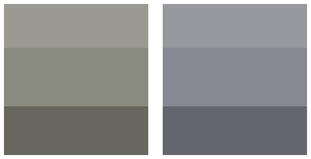
https://upload.wikimedia.org/wikipedia/commons/thumb/f/f9/Grays.svg/625px-Grays.svg.png
Knulclunk, vectorized by Fvasconcellos (talk · contribs), CC BY-SA 3.0, via Wikimedia Commons

In the above image a warmer gray can be seen on the left and a colder gray is featured on the right. Temperature as an aspect of colour is one of the reasons that mixing your own colours is so important. Buying colours individually can often lead to colours feeling dull or not expressing the right temperature for a piece. Learning how to mix colours can also give a lot more flexibility based on what ratio of colours you mix.

BenRG, Public domain, via Wikimedia Commons

The above image is the reason why green is a complicated colour biologically. This chart represents the three types of cone cells usually present in the human eye. In full-colour human vision there is a colour-detecting cone cell for red, blue, and green wavelengths. The three arcs represent how much each type of cell responds to wavelengths of light. The one labelled with an S is the blue cone, the M is the green cone, and the L is the red cone. The green cone encapsulates the most the largest range of greens, but it it’s not the only cone that detects green. The red cone heavily overlaps with the wavelength range of the green cone. This means that twice the amount of cone cells are sending signals in response to green colours than any other colour when all cones are present. I believe that this makes it a lot easier for people to differentiate shades of green compared to shades of other colours but I’m not sure of the details.


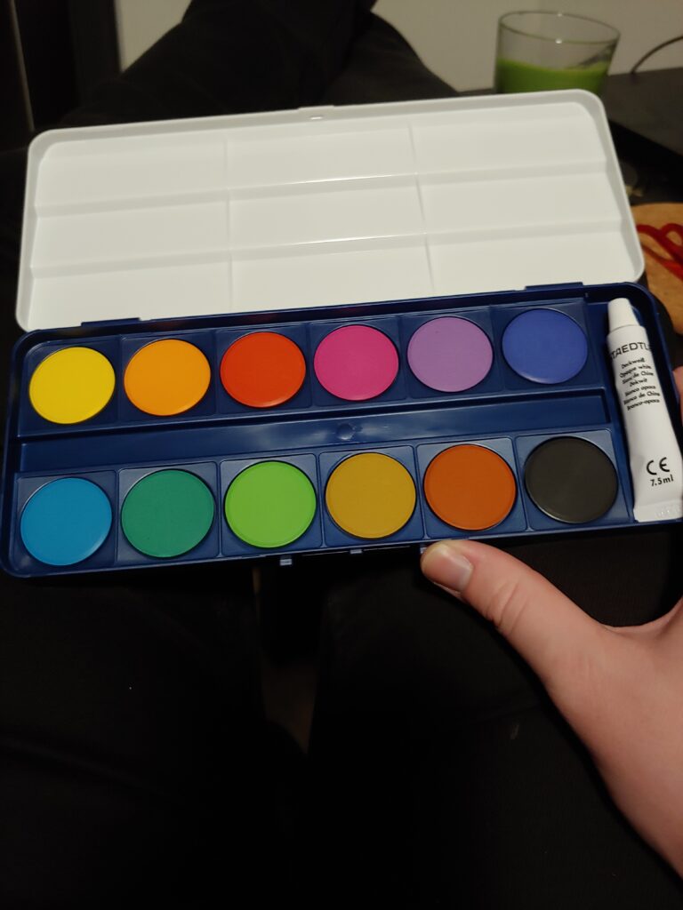
I found this video online and found it to be a really comprehensive look at mixing green. In this case it’s with oil paint. I decided to do a similar exercise for my first project in this free inquiry. I didn’t want to drop a ton on high quality watercolour paints so I got a cheaper set. I was a bit worried about not having a range of options that would work for me, but the set has a few blues and yellows which should give me some range of greens I can make. There’s also a few not quite blue or yellow colours that I might experiment around with as well (even though I’m not entirely sure if they’ll make greens).

My watercolour set. A bit limited but I think there’s enough blues and yellows to work with.


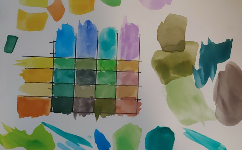
I found that above video to be a really good starting point for my own exercises. For a technical exercise I’m going to a similar thing to the video above by Walcott Fine Art. I’m going to make a table with the yellows and blues that I have and fill it in with the resulting colours that these paints make. I’m a bit unsure of what to do for the creative aspect of this topic, but I think I might have an idea. My introduction to this free inquiry project doesn’t have a featured image for it so I think it would be fun to try to make one. I’m not entirely sure what I want this image to be, but I’ll give it some thought and figure it out more as I get closer to it.

I’m pretty happy with the end result of this exercise. There’s a few colours that are definitely not green, but that’s the whole point of experimenting with them. I figured that I understood the process of using watercolours from using them from time to time, but wanted to double check my understanding. I found that this article was a useful place to go to help refresh me. It has some interesting information on contouring too which I might come back to later on in this free inquiry project.

I didn’t have any labelled names for the colours in my set which made it a bit complicated to keep track of which colour was which. I decided to paint the colours unmixed on the outside of the table. I found that this was a good strategy for helping me get experience with what colours result from the mixing. Being able to see the initial colours and judge things like their temperature and hue seems like it helped me understand how colours mix together. The downside of this approach is that it was tricky to relate those colours back to the watercolour pucks, especially when they started to get other colours mixed on top of them.

The watercolour paints being in puck form was also a bit challenging for me. I found it difficult to judge how much colour I was lifting from them. I’m not sure how accurate my resulting table is or if the colours on it lean towards ratios that aren’t 50/50. A 50/50 ratio of colours might not even be the best way to get to the desired green the colours make. Paints aren’t perfect samples of colours and often the smaller hues in them can interact or cancel each other. I found that the bottom colour in the second column was pretty surprising in this way. The reddish-orange and blue made a purple-gray colour. Colours that are truly complimentary to each other would create black because they’d absorb the wavelengths of each others light.

Matching colours with paint will hopefully make this ratio question less worrying. Trying to recreate a specific colour seems like it would be more concrete than trying to find the abstract “true” end result of mixing two colours. Matching colours isn’t the easiest process either, but it provides a good criteria to assess accuracy.

I’ve been recommended this book by an art professor and a few artists friends. I haven’t read it yet but it seems like a really engaging guide to colour mixing. Colours are really complicated phenomenon and their rules and principles can often go against our beliefs in how they should work.


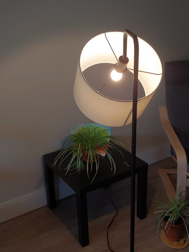
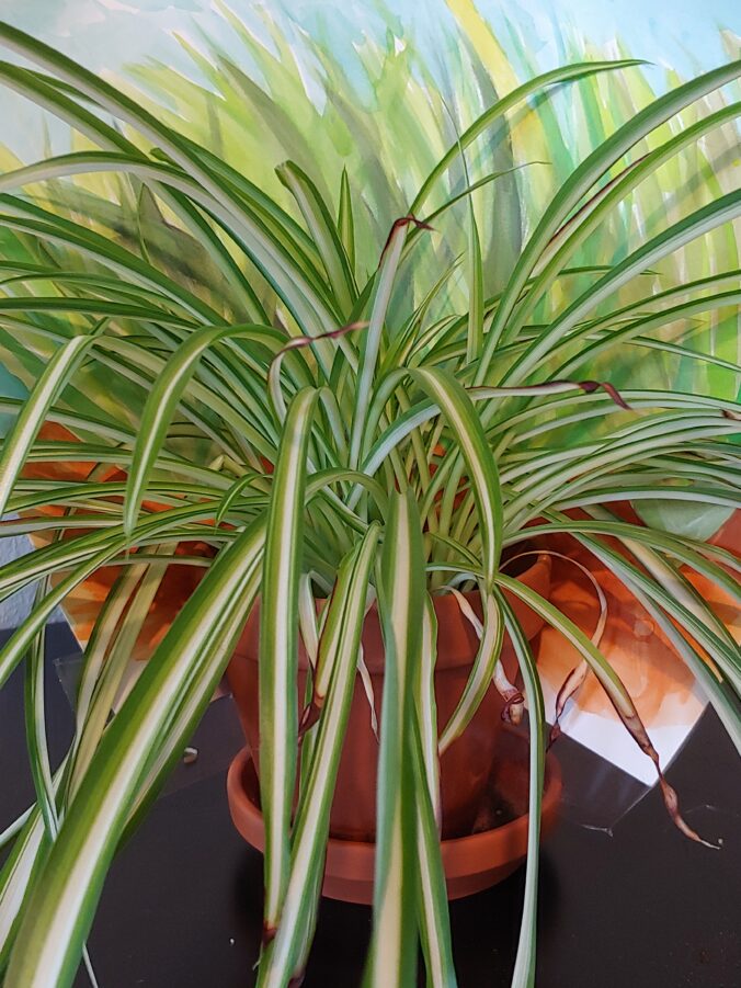
My plant photography setup

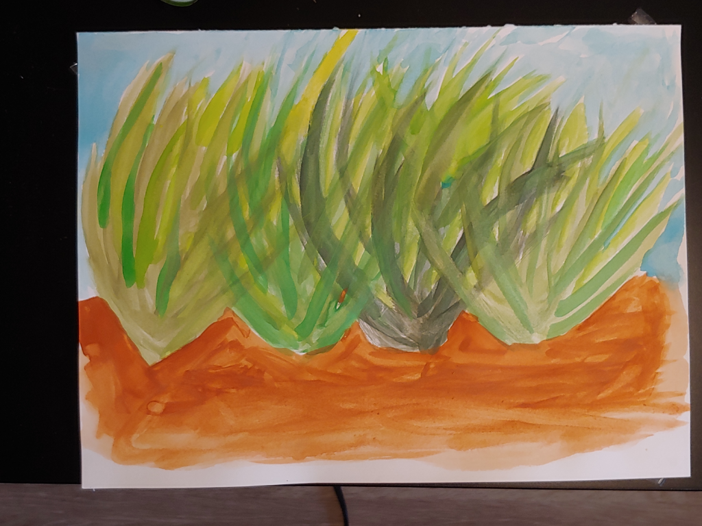
For my creative exercise I decided to make a watercolour painting using different shades of green. I wanted to make something I could use as a featured image for my introductory blog post to this free inquiry project. If you’re going through this posts after I’ve made them all, you’ve already seen it. I thought it would be fun to try to have an image that included one of my house plants and some watercolour artwork. I decided to paint something like a watercolour background for a plant and then take a picture of them together. This limited me due to a few factors. I didn’t really have any pieces of paper that were big enough to create a large encompassing background. I have a few really large sheets of newsprint and cartridge paper. Using water on these types of paper would probably just lead to a mulchy mess quickly. This limited me to some sturdier multimedia paper that was bigger than regular printer paper, but not all that large. It also limited me to using one of my smaller spider plants to fit in front of the background. I don’t think these sizing limits were too derailing really and they gave me a good idea of what type of background I wanted to make (something grassy to match the spider plant).

The background painting I made

I found that this was a really enjoyable exercise. Being able to use watercolour paint in much broader strokes than what I used for the table was nice and relaxing. I ran into a few issues that seem important to pay attention to. One of the main ones was mixed colours not fully looking like the ones I made for the table. This is likely due to finer details and mixing ratios. I think things like this are pretty impossible to avoid in traditional art and should just be embraced. My table is still a really good resource for getting the initial directions to a colour I have in mind. I think that it’s okay to not be too consistent with things like this either, the variety can be a nice element to a painting rather than something that takes away from it. I think I just need to relax a bit and accept that fact. This was also an issue when I was using a colour on the painting, ran out, and had to make more. There were a few situations where I just couldn’t quite get the same colour.

Paper definitely made a difference too. For the photo above I taped the painting down to a black coffee table. The water from the painting lead to the edges of the paper curling up and some wrinkling. This isn’t super unexpected because I used multimedia paper rather than watercolour paper specifically. In the future I might get some painters tape and tape the paper down while I work. This could be a nice way of creating a clean unpainted border around paintings too. Just using watercolour paper is the obvious (and much easier) solution, but watercolour paper is expensive and I’m a university student.

I realized something just at the end of my painting. I wasn’t giving enough attention to a core concept of watercolour painting, water. I was treating my paints almost like acrylic paints. I was mostly just using water to get paint off of the pucks and then apply it to the paper directly. It wasn’t until I started doing the larger areas of brown and blue that I realized my mistake. Just a little bit of the blue pigment went a really long way when mixed with enough water. You can see the difference in the brown dirt between my old idea and my new one. The brown closer to the plants is much darker and heavier. That’s not to say that I shouldn’t ever use my old idea of painting. Being able to put down some really dark colours is a useful tool. It’s just not a tool that needs to be used with all elements of a watercolour painting. The plants have a nice flowing element to them due to it being watercolour paint, but they’re heavily coloured. Again, not necessarily a bad thing as I’m happy with how they turned out. I should spend some time experimenting with lighter applications to build those techniques. I found that layering paints with either themselves or other colours was really useful. I was able to add a lot of the depth and variety that I wanted. Just doing the grasses in uniform colours wouldn’t really lead to an end-result that I’d like.

The day after I finished the painting I taped it to the pot of my spider plant and took a photo of it. It was a pretty overcast Victoria day so I used one of my lamps to light it. I was pretty happy with the end result.


Resources that I found that aren’t super relevant to this specific exercise, but want to come back to or contain useful information.

  • https://www.artsy.net/article/artsy-editorial-5-simple-watercolor-techniques-beginners
    • Some more advanced watercolour techniques that I’d like to experiment with, particularly wet on wet
    • Making gradients could be a fun exercise to try out
  • CD / Color By CaptainDisillusion
    • Really phenomenal resource on how colour works.
    • Seems like it would be extra useful for digital colour approaches in film (and digital art?)
    • Could be a good learning resource for a classroom, the character being played kind of comes across as a cynical Bill Nye fictional educator.
      • Complicated topics + cynical host + bleeped swears -> probably means that it would be more for an older student audience
    • Incredibly high quality animations for explaining the concepts
  • Gerl, E.J., Morris, M.R. The Causes and Consequences of Color Vision. Evo Edu Outreach 1, 476–486 (2008). https://doi.org/10.1007/s12052-008-0088-x
    • An interesting paper on colour vision and it’s role in evolution and biology.

Resources from week 2 of EDCI 336: Open Educational Resources

OER Africa Tutorial

This is a really great tutorial on the different types of open educational and has several really useful resources linked throughout it. It does a really good job of describing the differences between creative commons licenses and types of open educational resources.


  • MIT OCW (Open Courseware)
    • Collection of extremely well made free and openly licensed post-secondary courses.
    • Particularly useful for courses in STEM, but has courses in a large range of fields
    • VERY large variety of courses at undergraduate and graduate levels
  • Coursera
    • Large collection of MOOCs (Massive open online courses)
    • Can often reward students with certificates and documentation upon finishing a course
  • BC Campus Open Textbook Repository
    • Really accessible layout. Subjects are easy to find and sort by
    • Free textbooks are a phenomenal way of having textbooks to use as resources without requiring students or schools to spend large sums of money
    • Includes textbooks for trades which is fantastic. The trades often get left out of online resources.
    • Relatively new but really promising. Looking forwards to seeing how its library grows
  • CC Search
    • Really great option for searching for resources licensed under creative commons
    • Features a large range of search engines for various forms of media
    • Don’t need to swap between search engines and set up filters for content that is licensed to be used
  • OER Commons
    • Large resource of educational materials that are openly licensed
  • ShareEdBC
    • Content is specifically designed for the new BC curriculum
    • Can share resources with other teachers, creates a lot of potential for collective collaboration
  • Pexels
    • Free to use stock photos and videos
  • Unsplash
    • Free to use stock photos

EDCI 336: Week Two Reflection

I found this week’s topics to be really useful for me. Legal systems aren’t the most interesting thing to study, but I have definitely been really curious about what creative commons licenses actually meant. They’re all over the place in a ton of media I like and in online communities. The later can manifest in some strange ways. That I’ll discuss further on in this post. As someone who would like to make content online, this started to bounce around in my mind a lot. I was really glad to see it brought up in this course. It was something that I was concerned about when it came to making educational resources as well as my own personal projects.


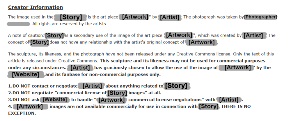
The end result of not following proper creative commons procedures


This example comes from a website where people write short horror stories as part of a larger collective universe. The stories themselves are all licensed under creative commons licenses, but relatively recently the site has had to go through some big changes due to licensing. A lot of the images featured in the stories weren’t licensed under creative commons and were not approved for use. The excerpt above is now at the bottom of one of the stories were they were able to get permission from the artist despite originally using an image in an unapproved context. This story was written soon after the site began and has been one its most popular stories since. In this case the image of the sculpture could stay with this large disclaimer at the end of the story thanks to the original artist. I think that this is a really important example of why proper creative commons practices should always be followed regardless of the project being done or the resource being made. This story was written when this website was an extremely small project done for fun by a group of writers. The original author likely didn’t give it too much thought and just selected a picture of a statue that fit with their ideas for the story.

Since the site has undergone significant growth and expanded really rapidly, situations like this are suddenly a large issue. The site owners want to keep avoid any potential legal action, but could end up in a difficult balancing act. A lot of the images associated with these stories were really iconic and popular with fans of the website. The original owners for some of the unauthorized images could not be found or reached so the images would to need be replaced. These new images would have to be accepted by the fanbase of the site which brings up the issue of plagiarism. Another precarious legal situation where the replacement images for the stories had to be both unique enough to not plagiarize the original artists but still be familiar and accepted by the community. There was always the risk of fans continuing to use old images in their creations if the new designs weren’t appealing to them. It was an overall bad situation and one that knowledge about creative commons licensing and good practice could have prevented.

It definitely feels like an extreme situation, but I think it’s a good highlight of the problems that can come with the internet and resource licensing. You can never really know when something might get popular or attract an audience. Keeping your resources in accordance with licensing rules is a lot easier than trying to do it in the future or deal with legal action.


I found a lot of the resources featured this week to be really useful for things outside of education as well. CC Search is a really fantastic resource for finding resources licensed under creative commons. Having a large number of search engines in the same place is really great, especially when CC Search automatically filters the results. It makes it a lot easier to use multiple search engines and there’s no need to adjust the search settings on things like Google Images. I’m hoping to use it to find images to use in art if I ever need resources.

I’ve made a separate blog post organizing some of the resources from this class that can be found here

Free Inquiry Project – Artistic Practices: Introduction

I was struggling a lot to find a topic for my free inquiry project. My initial goal was to work towards painting some of my houseplants in watercolour paint. I found that this was a pretty clear goal and something that I would find engaging. I started to have difficulties when I began trying to plan out a way to pace this goal and what specific milestones I should try to move through to get there. Because of this difficulty and the nature of art, I decided to focus my inquiry project on my artistic practices and the often tangential way they can be tied together. Painting my plants in watercolour will be integrated into my approaches, but it will be treated less as an ultimate end goal.

I’ve done art for a while, but am still relatively new to it and inexperienced with a lot of mediums. I decided not to make learning how to work with watercolour paint and learning how to apply those techniques to painting plants my ultimate end goal for several reasons. My first reason has to do with my attitude regarding art. I see art as a constantly ongoing process and one where there often aren’t sufficient metrics to judge progress in a short term frame of time. If I made painting a plant in watercolour my ultimate goal, I could theoretically just do that tomorrow morning. It wouldn’t be the last piece of art I ever made and it likely wouldn’t even be my last time trying to paint a plant in watercolour. Because I can try multiple times I considered adding some sort of addition to my goal. Maybe I could try to paint one of my plants in watercolour and make a final piece that meets specific standards. I found that this idea also started to fall apart as I tried to plan it. What types of qualities would I be looking for? How would I evaluate myself to judge whether or not I reached my goal. An important issue that kept coming up for me was “where would I stop?” I have never made a piece of art that has completely satisfied me. That isn’t to say that I didn’t find a ton of meaning and enjoyment in art. I just always came away from an art project with a few things stuck in my mind. Maybe they were things that I wanted to add but didn’t know how to add. Maybe they were things that I didn’t do as well as I would have liked or thought that I’d enjoy practising more. Ultimately I’ve never had an art project that’s functioned as an end point. This is in no way a detriment to artistic practice. In fact, I believe that this dynamic is one of the things that makes artistic practice so engaging and such a satisfying life-long hobby.

I’ll try to structure this inquiry project as a balance between guided and free inquiry. I’ll begin with the initial goal of making a watercolour painting of a plant, but I’ll try to allow myself to shift focus as the process occurs. If I complete my goal, I’ll use it as a chance to find out what elements I want to work further on and adjust my inquiry to that. Goals like this can be pretty tricky to manage in art. I will still need to deal with the uncertainty that can come with self-reflection and attempting to judge when I’m ready to attempt my watercolour painting. This uncertainty is a pretty large downside compared to alternative approaches I could take. The main alternative approach to this would be to paint a plant right away. I could simply try to do my best at it and use it as a chance to get used to the material, techniques, and process of doing so. Once I have completed the painting I can use that as a starting point and identify the core concepts that I want to spend more time with. This approach is something that I’d genuinely recommend to people interested in trying new things in art. Often times the best way to learn how to do something is to sit down and do it, regardless of what your past experience is. The problem with this approach is that it can be really uncomfortable and scary to try something totally new in this way. It also can be really demotivating. It’s very easy to slip into a strict dualistic mindset where a learner can view themselves as just untalented and fixed at that level of ability. Art can amplify these feelings because there’s usually an overwhelming amount of elements that a learner can few as lacking. Making progress in art can take a long time too. If learners don’t get the chance to experience that progress in the short term then they might not be able to hang onto a growth mindset.

To find some balance in my inquiry, I’ll start by pacing myself with the watercolour painting and look into techniques and resources for it first. These techniques should help me to get comfortable with watercolour. I’ll try to focus on two key art fundamentals, paint techniques and line work. To give myself a deadline for the watercolour plant painting, I’ll try to just work on a few set techniques before working on the painting. Once the painting is completed I’ll use it as a reference point for what art fundamentals and techniques I’d look to work on next. Once I’ve determined that I’ll find resources to help me approach it and ways of testing myself with it. A critical aspect of this inquiry for me is going to be balancing creative work and technical work. I often slide into habits of focusing too much on fundamentals and avoiding creative work. This may manifest in this inquiry project with how I’m treating creative projects as goals that are supported by art fundamental practices leading up to them. This is especially a relevant issue for me with how I approach these two forms of work. I find working on art fundamentals to be a much more relaxing and easier experience than creative projects. Creative projects can tend to feel high-pressure for me due to the self-judgment that can come with the frustration of not fully being able to express what I want to express. I’m still quite new to art so this will definitely be something that I’ll need to pay attention to.

During my first week of the inquiry project I’ll focus on using line work to produce texture and making greens to work with. I’ll find educational resources concerning both and decide on a technical and creative exercise to help me practice them.

« Older posts Newer posts »