This week we focused on graphic creation and there were a lot of fun things covered in this class. I’m pretty familiar with photo-editing programs like Photoshop and GIMP (GNU Image Manipulation Program) and visual art programs like Clip Studio Paint but was interested to see what types of other options are out there. I was really really surprised when PowerPoint was brought up, but it seems like a phenomenal resource. I’ve done similar things with the program before for making images, but it was usually just to make images of slides. Using it to combine images and apply effect is something I hadn’t thought of before. It’s a fun tool to play around with too. Already knowing the way PowerPoint works makes it pretty easy to get adjusted to editing images with it.
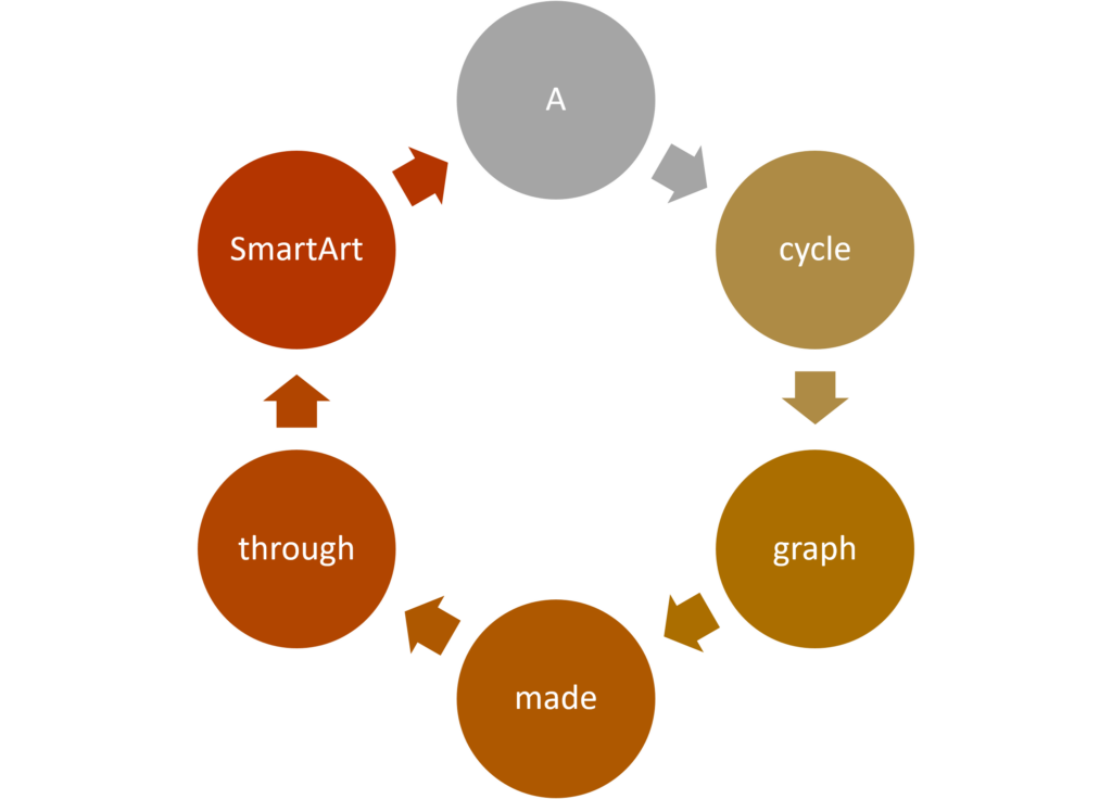
I think that PowerPoint will serve two main functions for me with this. The first is for the SmartArt graphics which I really like. Trying to build a graph like the ones available through SmartArt is always really frustrating (especially if you’re using a picky program like GIMP). I think that I’ll get a ton of use out of this feature in teaching and just for personal uses as well.


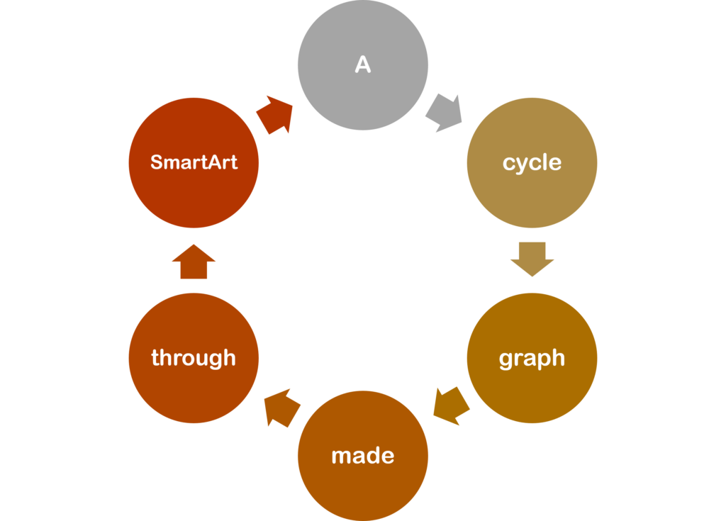
These images are super useful although they need to be treated fairly carefully. The version on PowerPoint is a vector image and stays clean regardless of adjustments, but exporting them as a raster image can lead compression artifacts becoming an issue. Ensuring that the graphs are made with this in mind is helpful for reducing this effect. In the case of the graphs above, I removed the outlines around the shapes and changed the font to a thicker one.
PowerPoint does give the option to save these graphics as vector images (as .wmf and .emf files specifically). I’m not entirely sure how good this conversion is though. Something changed between making the images on PowerPoint and putting them in this WordPress blog. If you look at the graph above you can see that the font has been changed and a lot of the text is no longer centred in the circles. I can’t truly fault this to PowerPoint though. WordPress doesn’t accept .wmf and .emf filetypes due to security risks so I needed to convert them to .svg (the standard vector image file type) through a file-conversion website. The text was either changed when I saved the graph as a .wmf and .emf from PowerPoint or when I converted those files to .svg images. I’m writing this from a school computer and don’t have access to any software that would let me look at the .emf and .wmf files unfortunately. It’s definitely a difficult trade-off and the differences can be seen quite clearly in the graphs on this blog. The .png graph with adjustments has text that fits with the graph aesthetically and is centred in the circles (although it still has a bit of blur). The vector image graph has much cleaner shapes and texts and doesn’t seem out of focus like the .png version.

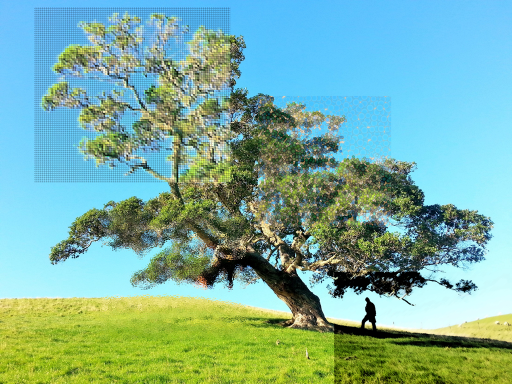
The second function is adding “artistic effects” to images. I find that photo filters can be a bit hard to track down, although I haven’t experimented too much with other programs. They’re really straightforwards to use in PowerPoint. The filters are easy to find and the advanced options give a decent amount of flexibility. I made the image above by inserting the same image several times, cropping them, and then applying the filters them. It works well to give the impression that different areas of a single image are under the effect of different filters.
I tried out the in-browser vector image editor Vectr during class. It seems like a really good tool for creating vector images in terms of accessibility. Not needing to download software is convenient and would be good for a lot of people. It’s understandably limited in a few ways, but for what it is I think it’s a good tool. I think it can be a bit lacking in teaching people how vector graphics work and how to make them through other means. For someone unfamiliar with vector graphics it could be slightly frustrating. Shapes often change when shrunk or expanded which is something that needs to be accounted for and worked around. The guides to position shapes are really well implemented and it’s a quick process to line things up with each other. Free-drawn lines can be a bit strange, but nothing too extreme that would make them no longer useful.
Other Useful Resources
- Prisma
- Fun way of adding painting-based filters to photos
- Mirror Lab
- Seems like an interesting way of manipulating photos with set filters. Likely need to pay for the full version
- Wikipedia list of raster graphics editors and vector graphics editors
Leave a Reply
You must be logged in to post a comment.