Featured image: Chris-martin, Public domain, via Wikimedia Commons
When it comes to drawing plants, the colour green is (unsurprisingly) a pretty critical element. Creating green shades can run into a lot of the same issues that mixing other colours can, but green has a few complicating factors. The first factor is that green is an incredibly common colour. Most people are familiar with all the varieties it can come in from nature. Blues and reds come in many shades as well, but encountering these shades in your day-to-day life is a lot less likely. The second factor is that green is a complicated colour in how it relates to vision due to biology.
I have some experience with mixing acrylic paints, but not much. My experience was mostly in trying to make individual colours out of the traditional primary colours: red, yellow, and blue. There was definitely a focus on trying to match shades of, but not really an exploration of the shades of a specific colour. One of the key things to remember at colour is temperature. Temperature is a complicated phenomenon based on thermal radiation and ideal blackbody emitter laws. Really long complicated story short, warmer colours tend to have more yellows, oranges or reds in them whereas colder colors have blues.
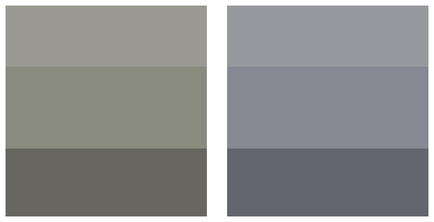
In the above image a warmer gray can be seen on the left and a colder gray is featured on the right. Temperature as an aspect of colour is one of the reasons that mixing your own colours is so important. Buying colours individually can often lead to colours feeling dull or not expressing the right temperature for a piece. Learning how to mix colours can also give a lot more flexibility based on what ratio of colours you mix.
The above image is the reason why green is a complicated colour biologically. This chart represents the three types of cone cells usually present in the human eye. In full-colour human vision there is a colour-detecting cone cell for red, blue, and green wavelengths. The three arcs represent how much each type of cell responds to wavelengths of light. The one labelled with an S is the blue cone, the M is the green cone, and the L is the red cone. The green cone encapsulates the most the largest range of greens, but it it’s not the only cone that detects green. The red cone heavily overlaps with the wavelength range of the green cone. This means that twice the amount of cone cells are sending signals in response to green colours than any other colour when all cones are present. I believe that this makes it a lot easier for people to differentiate shades of green compared to shades of other colours but I’m not sure of the details.
I found this video online and found it to be a really comprehensive look at mixing green. In this case it’s with oil paint. I decided to do a similar exercise for my first project in this free inquiry. I didn’t want to drop a ton on high quality watercolour paints so I got a cheaper set. I was a bit worried about not having a range of options that would work for me, but the set has a few blues and yellows which should give me some range of greens I can make. There’s also a few not quite blue or yellow colours that I might experiment around with as well (even though I’m not entirely sure if they’ll make greens).
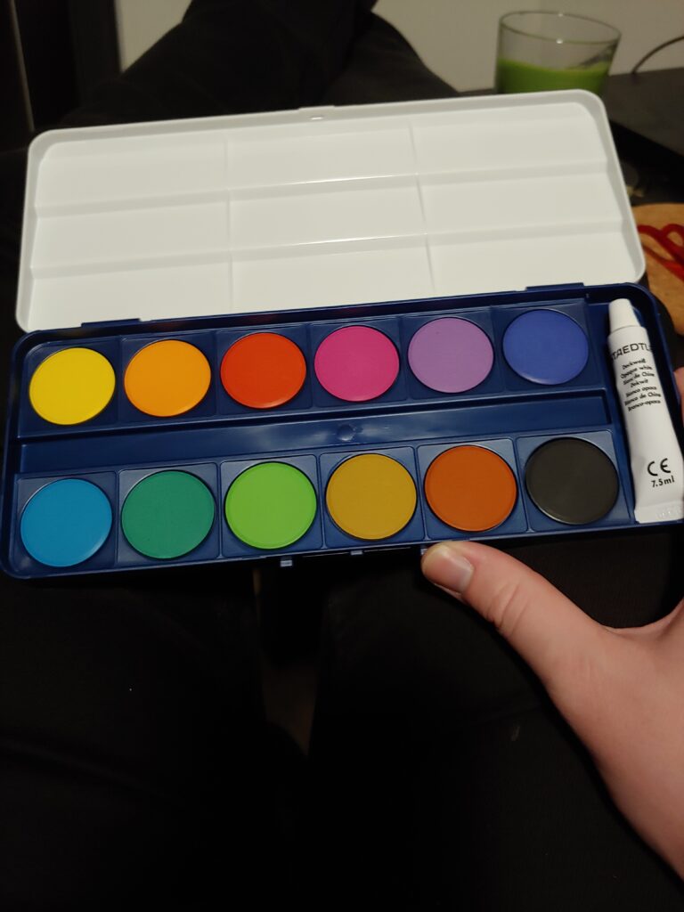
I found that above video to be a really good starting point for my own exercises. For a technical exercise I’m going to a similar thing to the video above by Walcott Fine Art. I’m going to make a table with the yellows and blues that I have and fill it in with the resulting colours that these paints make. I’m a bit unsure of what to do for the creative aspect of this topic, but I think I might have an idea. My introduction to this free inquiry project doesn’t have a featured image for it so I think it would be fun to try to make one. I’m not entirely sure what I want this image to be, but I’ll give it some thought and figure it out more as I get closer to it.
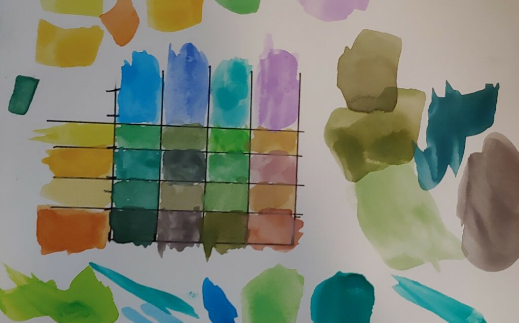
I’m pretty happy with the end result of this exercise. There’s a few colours that are definitely not green, but that’s the whole point of experimenting with them. I figured that I understood the process of using watercolours from using them from time to time, but wanted to double check my understanding. I found that this article was a useful place to go to help refresh me. It has some interesting information on contouring too which I might come back to later on in this free inquiry project.
I didn’t have any labelled names for the colours in my set which made it a bit complicated to keep track of which colour was which. I decided to paint the colours unmixed on the outside of the table. I found that this was a good strategy for helping me get experience with what colours result from the mixing. Being able to see the initial colours and judge things like their temperature and hue seems like it helped me understand how colours mix together. The downside of this approach is that it was tricky to relate those colours back to the watercolour pucks, especially when they started to get other colours mixed on top of them.
The watercolour paints being in puck form was also a bit challenging for me. I found it difficult to judge how much colour I was lifting from them. I’m not sure how accurate my resulting table is or if the colours on it lean towards ratios that aren’t 50/50. A 50/50 ratio of colours might not even be the best way to get to the desired green the colours make. Paints aren’t perfect samples of colours and often the smaller hues in them can interact or cancel each other. I found that the bottom colour in the second column was pretty surprising in this way. The reddish-orange and blue made a purple-gray colour. Colours that are truly complimentary to each other would create black because they’d absorb the wavelengths of each others light.
Matching colours with paint will hopefully make this ratio question less worrying. Trying to recreate a specific colour seems like it would be more concrete than trying to find the abstract “true” end result of mixing two colours. Matching colours isn’t the easiest process either, but it provides a good criteria to assess accuracy.
I’ve been recommended this book by an art professor and a few artists friends. I haven’t read it yet but it seems like a really engaging guide to colour mixing. Colours are really complicated phenomenon and their rules and principles can often go against our beliefs in how they should work.
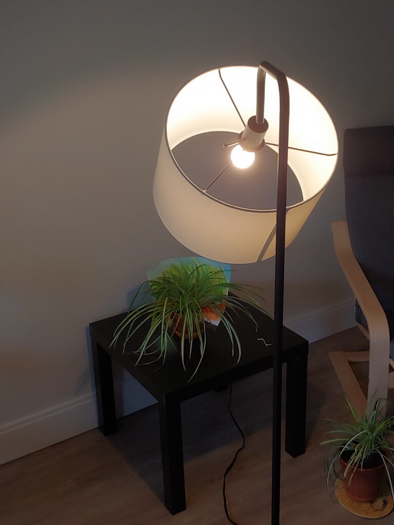
For my creative exercise I decided to make a watercolour painting using different shades of green. I wanted to make something I could use as a featured image for my introductory blog post to this free inquiry project. If you’re going through this posts after I’ve made them all, you’ve already seen it. I thought it would be fun to try to have an image that included one of my house plants and some watercolour artwork. I decided to paint something like a watercolour background for a plant and then take a picture of them together. This limited me due to a few factors. I didn’t really have any pieces of paper that were big enough to create a large encompassing background. I have a few really large sheets of newsprint and cartridge paper. Using water on these types of paper would probably just lead to a mulchy mess quickly. This limited me to some sturdier multimedia paper that was bigger than regular printer paper, but not all that large. It also limited me to using one of my smaller spider plants to fit in front of the background. I don’t think these sizing limits were too derailing really and they gave me a good idea of what type of background I wanted to make (something grassy to match the spider plant).
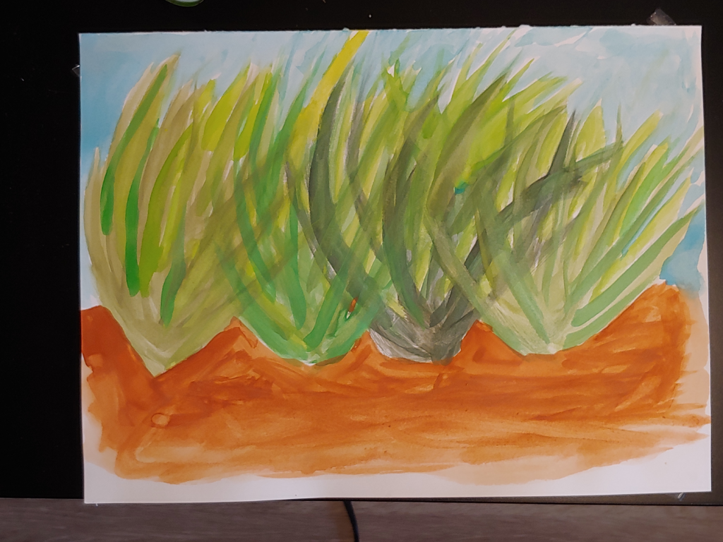
I found that this was a really enjoyable exercise. Being able to use watercolour paint in much broader strokes than what I used for the table was nice and relaxing. I ran into a few issues that seem important to pay attention to. One of the main ones was mixed colours not fully looking like the ones I made for the table. This is likely due to finer details and mixing ratios. I think things like this are pretty impossible to avoid in traditional art and should just be embraced. My table is still a really good resource for getting the initial directions to a colour I have in mind. I think that it’s okay to not be too consistent with things like this either, the variety can be a nice element to a painting rather than something that takes away from it. I think I just need to relax a bit and accept that fact. This was also an issue when I was using a colour on the painting, ran out, and had to make more. There were a few situations where I just couldn’t quite get the same colour.
Paper definitely made a difference too. For the photo above I taped the painting down to a black coffee table. The water from the painting lead to the edges of the paper curling up and some wrinkling. This isn’t super unexpected because I used multimedia paper rather than watercolour paper specifically. In the future I might get some painters tape and tape the paper down while I work. This could be a nice way of creating a clean unpainted border around paintings too. Just using watercolour paper is the obvious (and much easier) solution, but watercolour paper is expensive and I’m a university student.
I realized something just at the end of my painting. I wasn’t giving enough attention to a core concept of watercolour painting, water. I was treating my paints almost like acrylic paints. I was mostly just using water to get paint off of the pucks and then apply it to the paper directly. It wasn’t until I started doing the larger areas of brown and blue that I realized my mistake. Just a little bit of the blue pigment went a really long way when mixed with enough water. You can see the difference in the brown dirt between my old idea and my new one. The brown closer to the plants is much darker and heavier. That’s not to say that I shouldn’t ever use my old idea of painting. Being able to put down some really dark colours is a useful tool. It’s just not a tool that needs to be used with all elements of a watercolour painting. The plants have a nice flowing element to them due to it being watercolour paint, but they’re heavily coloured. Again, not necessarily a bad thing as I’m happy with how they turned out. I should spend some time experimenting with lighter applications to build those techniques. I found that layering paints with either themselves or other colours was really useful. I was able to add a lot of the depth and variety that I wanted. Just doing the grasses in uniform colours wouldn’t really lead to an end-result that I’d like.
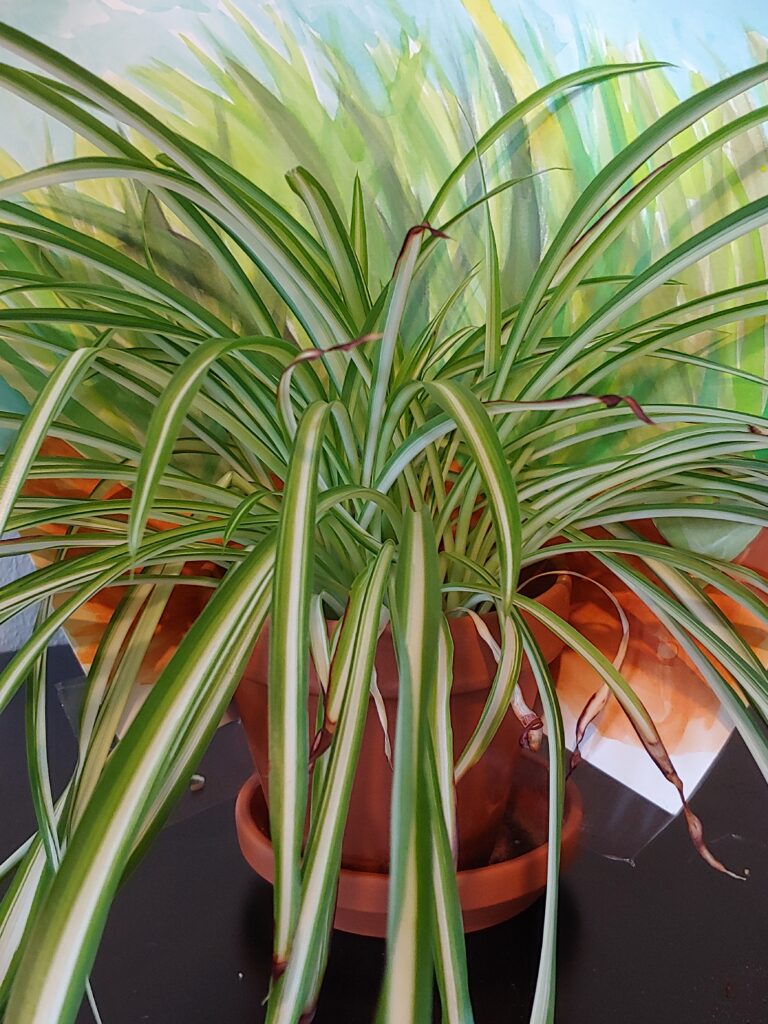
The day after I finished the painting I taped it to the pot of my spider plant and took a photo of it. It was a pretty overcast Victoria day so I used one of my lamps to light it. I was pretty happy with the end result.
Resources that I found that aren’t super relevant to this specific exercise, but want to come back to or contain useful information.
- https://www.artsy.net/article/artsy-editorial-5-simple-watercolor-techniques-beginners
- Some more advanced watercolour techniques that I’d like to experiment with, particularly wet on wet
- Making gradients could be a fun exercise to try out
- CD / Color By CaptainDisillusion
- Really phenomenal resource on how colour works.
- Seems like it would be extra useful for digital colour approaches in film (and digital art?)
- Could be a good learning resource for a classroom, the character being played kind of comes across as a cynical Bill Nye fictional educator.
- Complicated topics + cynical host + bleeped swears -> probably means that it would be more for an older student audience
- Incredibly high quality animations for explaining the concepts
- Gerl, E.J., Morris, M.R. The Causes and Consequences of Color Vision. Evo Edu Outreach 1, 476–486 (2008). https://doi.org/10.1007/s12052-008-0088-x
- An interesting paper on colour vision and it’s role in evolution and biology.

Leave a Reply
You must be logged in to post a comment.